I love writing with resist or "mask". It's the rubbery stuff that protects your paper (or primed canvas) from absorbing ink or paint and then rubs off. My hands-down favorite is Pebeo
http://www.paperinkarts.com/pebm45.html which I buy in the big (8 oz) bottle.
 |
| This writing is the paper showing through -- masking fluid was used in metal pens and then a background was done over it, several layers of watered-down color with plastic wrap texture, then the resist is rubbed off and viola - white lettering. |
Many people have trouble with it because they use brushes and the liquid is very hard to manage plus it ruins the brushes, but masking fluid works great in metal pens. And it just peels off if it dries in the pen. You can make corrections so easily too - just let it dry and rub off the misspelling - or part you don't like, whether a whole page, a line, or one bit of a letter. You can go back in after it dries and retouch places -- push in a rough edge with a fingernail or add a bit with a small pen to smooth something out.
First of all, you need to shake or stir your container of resist. Shaking makes bubbles but since I strain it anyway I haven't found that to be a big problem. I pour it through a piece of nylon stocking into a small container. Usually I will then add some distilled water from a dropper bottle. How much will depend on the size and type of your pen, you just need it to flow nicely and not "glob" too much. It's similar to making your gouache the right consistency, but I'd beware of making it too thin since I don't know when it might lose its covering power. If it looks even and shiny on the paper after it dries you're OK even if very little color shows.
If you have made penciled guidelines for your writing you may want to go in and lighten them with a kneaded eraser until they are just barely enough to see, because painting over them will seal them in and unless you are using dark colors they can show. You can't erase them after writing or you will pull off the resist - look closely at the example with the rainbow and you will see a few pencil lines that are there forever.
Tape your paper securely onto a board since you will be getting it wet for the background. A drawing board, piece of Masonite, foamcore in a pinch will do. Tape all around all edges with good quality masking tape. Doing this before lettering is safest as you might mess up the resist when smoothing down the paper.
It helps to have a scrap of your paper for trials to make sure your resist is the right consistency and you have the "hang" of writing with it. Sometimes you need to put more pressure on the pen than usual to get it started. Often you will find you need to wipe the back of the pen after dipping to keep it from blobbing. Keep at it, I have made it work even on canvas, and with nibs from pointed pen to half-inch wide, over other writing, etc.
It's critical that your pen nib be clean or any color may leach into the resist and stain your paper. Give it a good scrub with window cleaner and a toothbrush to be sure.
 |
| lettering with resist and a Mitchel #2 nib, too many pencil lines! |
It still helps to have your paper at a slant, whether on a drafting table or slant board or a board in your lap resting on a table - try adjusting the angle if your resist isn't flowing well or if it's too fast and making blobs. Often a steeper angle than you usually use is helpful.
Clean your pen every now and then (may need to pull off dried resist or just give a quick scrub with a toothbrush over your water jar) and make sure you cover your container if left for a time.
Once your lettering is done, let it dry and look it over to see if you need any fixing as mentioned above. Now you get to do the fun part - coloring in the background.
You may have a picture or texture or color scheme in mind, or you might just want to play. You can use any paints or inks - gouache, acrylic inks, watercolor, etc. Don't be afraid to keep it a bit light as you can apply several layers of color for more control.
If you are a painter, just paint what you like. If you want something abstract, you can go with the "saran wrap" method used for backgrounds. This entails wetting the paper and dropping in various colors then covering it all with crinkled plastic wrap. Most methods for coloring paper will work on top of the resist. I find it works best to water down your colors a bit before dropping them in. Sometimes you may want to lift the plastic wrap and re-apply to help even things out. The first layer dries fairly quickly and you can lift the wrap after a few minutes to let the lines soften up if you prefer.
To make sure your lettering will be clearly readable, you should aim to have the background dark enough that the pale blue of the resist looks lighter than the background. If the writing still looks darker than the colors around it you will not be able to read it. You can do more layers, add color up next to the letters or across lines of writing, etc.
When your background is to your satisfaction, remove the resist by rubbing with a rubber cement pick-up (or your fingers!)
http://www.dickblick.com/products/crepe-rubber-cement-pickup/
You can see this one is going to need some more work for the letters in the yellow area to show up, it would have been much easier to add more color around them before taking off the resist.
In fact, after doing some fiddling, I overwrote the whole thing in resist again and added darker rainbow colors. If I had followed my own rule to color the background until the lettering in masking fluid was lighter than the background, I would have saved a lot of trouble. You can see where this piece ended up at
rainbow
Here's a piece where the background was done first with acrylic inks and plastic wrap, and then written on with resist (using a fairly big "B" nib). Black was then used over all to make the colors glow through the letters.
 |
| background with writing done with masking fluid |
Here's a rather poor photo (done before digital camera) showing the lettering after black was painted on and the resist rubbed off
 |
| original colors showing through letters protected by resist when laying a black background |
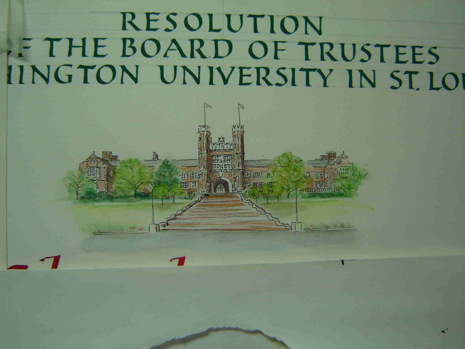
On this certificate the name was done with masking fluid (resist) and a Speedball nib, then colored blocks painted over. It was a solution to doing the name without the quotation marks around the nickname showing up too much and looking out of place in a formal setting.
Here's a piece with all the lettering and borders done in Pebeo masking fluid using B nibs and ruling pen.
 |
| Pebeo masking fluid laid down for all lines and lettering |
The second one shows the background added to look like the stained glass windows it was designed around and a bit of the stonework at the upper corners. Here's the finished piece:
The one below used resist to make a "dam" made by making a line of resist around a plate to give the "world" a clean edge when using the saran wrap method.
This one was done by lettering over a light saran wrap background and then more layers of the same technique darkened the background. Watercolor pencils were used to make clear where the lines of writing meet each other.
 |
| some of these are pretty old, so don't bother critiquing |
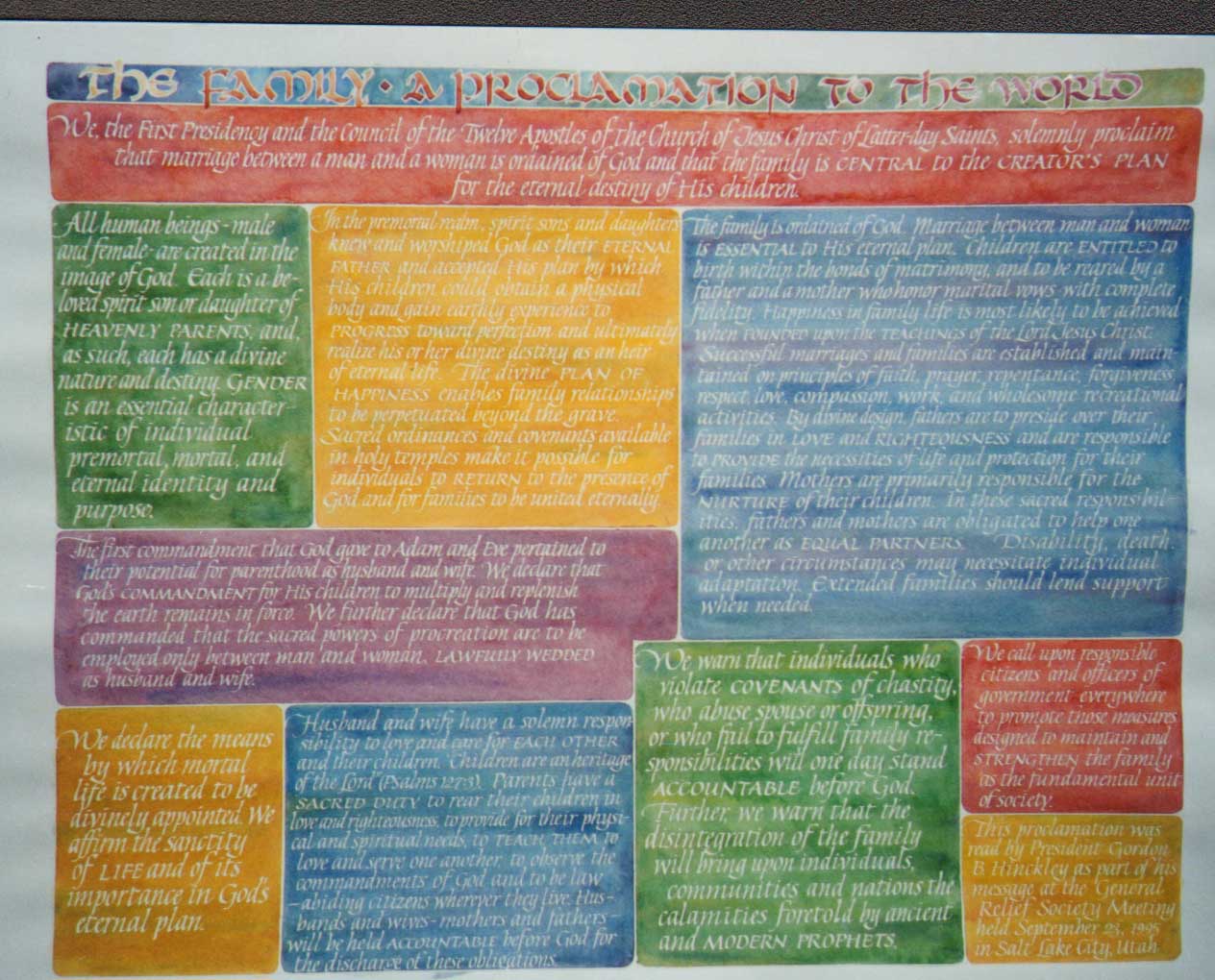
Look closely at the top line of this "Proclamation" - it was done with a wide pen using resist and after the background color was put on and the resist rubbed off, the letters were written in with a narrower nib to give them a white outline. The lines between sections were done with a ruling pen with the corners rounded while wet, the writing with various Mitchel nibs, all done with masking fluid -- you need to dip the pen and then scrape it across your container or sometimes wipe the back lightly with a rag to keep the masking fluid from blobbing. Water it down more for smaller nibs.
Have fun! Using masking fluid for calligraphy has many possibilities and is very forgiving.